- Learn
-
Blogs
- podman
- collections
- cheat sheet
- Webpack
- WSL
- Tools
- Tips
- RxJava
- Retrofit
- RecyclerView
- React
- Project
- Programming
- Picasso
- Outline
- Operator
- Open Source
- Null safety
- Memory
- Fragment
- Flutter
- ES6
- Do it Kotlin Project
- Dagger
- Coroutine
- Composer
- Border
- Babel
- Amazon
- Android
- Angular
- Bootstrap
- Bootstrap 3
- DOM
- Drupal
- Drupal7
- Fuse
- Hoisting
- HTML
- ionic
- Java
- Javascript
- jQuery
- JSON
- Layout
- Linux
- Motion Detect
- Nodejs
- PHP
- Primitive types
- React Native
- ReactJS
- Setting
- Ubuntu
- Views
- Web
- WebView
- Wordpress
- Kotlin
- MusicScore
side바의 높이를 content와 같게 만드는 방법

사이드바의 DIV의 높이를 content의 높이와 맞추기 위해서는 일반적인 방법으로 쉽지 않다. jQuery를 통해 제어하거나 Javascript를 사용하는 방법, css3의 flex를 통해 제어할 수 있었다.
다만, flex가 IE10, 11등 이하 계열에서 조금씩 작동 방식이 차이가 나고 있고, 잘 작동하지 않는 문제가 있었다.
- CSS3의 display의 flex 값을 통해 제어하는 방법
- jQuery를 통해 제어하는 바법
- 자바스크립트를 사용해 제어하는 방법
HTML 구조
컨텐츠와 사이드바의 일반 구조는 다음과 같다.
<div class="bodyContainerWrapper">
	<div class="bodyContainer">
		<div class="contentBox">
			<!-- main content goes here -->
		</div>

		<div class="sidebarBox">
			<!-- sidebar content goes here -->
		</div>
	</div>
</div>
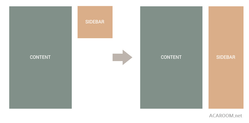
대략 아래와 같은 모양과 같이 사이드바가 메인컨텐츠의 크기와 동일하게 갖는것이 목표다.
jQuery를 통한 높이 맞추기
jQuery에서는 content와 sidebar의 높이를 outerHeight()함수를 통해 얻어올 수 있다. 얻어온 높이는 다음과 같은 조건문으로 제어가 가능하다.
// placing objects inside variables
var content = $('.contentBox');
var sidebar = $('.sidebarBox');

// get content and sidebar height in variables
var getContentHeight = content.outerHeight();
var getSidebarHeight = sidebar.outerHeight();

// check if content height is bigger than sidebar
if ( getContentHeight > getSidebarHeight ) {
	sidebar.css('min-height', getContentHeight);
}

// check if sidebar height is bigger than content
if ( getSidebarHeight > getContentHeight ) {
	content.css('min-height', getSidebarHeight);
}
jQuery는 처음에 잘 작동하는 것처럼 보였으나, 로딩시간이 길어지는 페이지에서는 잘 작동하지 않았다. 이유는 높이계산이 페이지가 모두 로딩될 때까지 기다려주지 않기 때문에 그렇다. 따라서 일정시간을 기다렸다가 계산해야 한다. setInterval()함수를 통해서 구현할 수 있다.
var content = $('.contentBox');
var sidebar = $('.sidebarBox');
var count = 0;
var myTimer;

function setEqualContainer() {
	var getContentHeight = content.outerHeight();
	var getSidebarHeight = sidebar.outerHeight();

	if ( getContentHeight > getSidebarHeight ) {
		sidebar.css('min-height', getContentHeight);
	}

	if ( getSidebarHeight > getContentHeight ) {
		content.css('min-height', getSidebarHeight);
	}
}

// creating the timer which will run every 500 milliseconds
// and will stop after the container will be loaded
// ...or after 15 seconds to not eat a lot of memory

myTimer = setInterval( function() {
	count++;

	if ( $('.testContainer').length == 0 ) {
		setEqualContainer();
	} else {
		setEqualContainer();
		clearInterval(myTimer);
	}

	if ( count == 15) {
		clearInterval(myTimer);
	}
}, 500);
이러한 방법은 약간의 지연시간을 주고 계산하기 때문에 비교적 잘 작동한다. 단, 문제는 빠르게 로딩된 페이지에서는 순간적으로 낮은 높이에서 계산된 높이가 보이는 약간 거슬리는 화면을 연출한다. 이것을 해결하기 위해서는 아무래도 CSS의 방법을 이용할 수 밖에 없는 것 같다.
만일 모바일 환경을 고려해 만들고자 한다면 responsive한 화면의 동작을 고려해야할 것이다. min-height 속성을 !important를 사용해 비활성화하여야 할 것이다. 모바일 화면에대한 미디어 쿼리에 다음과 같이 작성할 수 있다.
@media (max-width: 767px) {
	.contentBox,
	.sidebarBox {
		min-height: initial !important;
	}
}
CSS를 사용한 높이 맞추기
두번째로 사용할 수 있는 방법으로는 오로지 CSS를 통해서만 높이를 맞추는 방법이 있다. 먼저 CSS3의 flex를 쓴다면 아주 간단히 해결될 수 있으나 지원되지 않는 브라우저가 있을 수 있으므로 flex를 쓰지 않는 트릭을 구현해 보자.
.sidebarBox {
	margin-top: -9999px;
	margin-bottom: -9999px;
	padding-top: 9999px;
	padding-bottom: 9999px;
}
.bodyContainer {
	overflow: hidden;
}
Window 사이즈가 변경될때마다 맞추기
<script language="JavaScript" type="text/javascript">
$(document).ready(function(){
    $('selector').css('width', $(window).width());
    $('selector').css('height', $(window).height());
    $(window).resize(function() {
        $('selector').css('width', $(window).width());
        $('selector').css('height', $(window).height());
    });
});
</script>
창크기가 변경되면 관련 요소들의 너비와 높이를 재조정하는 방법이다.

Updated: 19 Oct 2017
Mobile Developer at Comparethemarket | Multiplatform | Full Stack | Kotlin, Flutter, Java, C/C++, Go, PHP
Related Contents

Language
Get in touch with us
"If you would thoroughly know anything, teach it to other."
- Tryon Edwards -